在Android开发应用中,默认的Button是由系统渲染和管理大小的。而我们看到的成
功的移动应用,都是有着酷炫的外观和使用体验的。因此,我们在开发产品的时候,需要对默认按钮进行美化。在本篇里,笔者结合在应用开发中的经验,探讨一下
自定义背景的按钮、自定义形状按钮的实现方法。
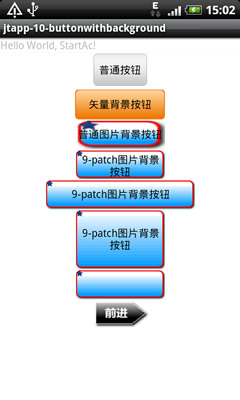
首先看实现效果截图:
自定义背景的按钮目前有2种方式实现,矢量和位图。
1. 矢量图形绘制的方式
矢量图形绘制的方式实现简单,适合对于按钮形状和图案要求不高的场合。步骤如下:
(a) 使用xml定义一个圆角矩形,外围轮廓线实线、内填充渐变色,xml代码如下。
-
//bg_alibuybutton_default.xml
-
-
<?
xml
version
=
"1.0"
encoding
=
"utf-8"
?>
-
<
layer-list
xmlns:android
=
"http://schemas.android.com/apk/res/android"
>
-
<
item
>
-
<
shape
android:shape
=
"rectangle"
>
-
<
solid
android:color
=
"#FFEC7600"
/>
-
<
corners
-
android:topLeftRadius
=
"5dip"
-
android:topRightRadius
=
"5dip"
-
android:bottomLeftRadius
=
"5dip"
-
android:bottomRightRadius
=
"5dip"
/>
-
</
shape
>
-
</
item
>
-
<
item
android:top
=
"1px"
android:bottom
=
"1px"
android:left
=
"1px"
android:right
=
"1px"
>
-
<
shape
>
-
<
gradient
-
android:startColor
=
"#FFEC7600"
android:endColor
=
"#FFFED69E"
-
android:type
=
"linear"
android:angle
=
"90"
-
android:centerX
=
"0.5"
android:centerY
=
"0.5"
/>
-
<
corners
-
android:topLeftRadius
=
"5dip"
-
android:topRightRadius
=
"5dip"
-
android:bottomLeftRadius
=
"5dip"
-
android:bottomRightRadius
=
"5dip"
/>
-
</
shape
>
-
</
item
>
-
</
layer-list
>
同样定义bg_alibuybutton_pressed.xml和bg_alibuybutton_selected.xml,内容相同,就是渐变颜色不同,用于按钮按下后的背景变化效果。
(b) 定义按钮按下后的效果变化描述文件drawable/bg_alibuybutton.xml,代码如下。
-
<?
xml
version
=
"1.0"
encoding
=
"UTF-8"
?>
-
<
selector
xmlns:android
=
"http://schemas.android.com/apk/res/android"
>
-
<
item
android:state_pressed
=
"true"
-
android:drawable
=
"@drawable/bg_alibuybutton_pressed"
/>
-
<
item
android:state_focused
=
"true"
-
android:drawable
=
"@drawable/bg_alibuybutton_selected"
/>
-
<
item
android:drawable
=
"@drawable/bg_alibuybutton_default"
/>
-
</
selector
>
(c) 在你需要的界面定义文件中,如layout/main.xml中定义一个Button控件。
-
<
Button
-
android:layout_width
=
"120dip"
-
android:layout_height
=
"40dip"
-
android:text
=
"矢量背景按钮"
android:background
=
"@drawable/bg_alibuybutton"
/>
这样,自定义背景的按钮就可以使用了,在实现onClick方法后就可以响应操作。
2. 9-patch图片背景方式
此种方法相对复杂繁琐,但可以制作出更多、更复杂样式的按钮图样。
什么是9-patch格式呢?
9-patch格式,是在Android中特有的一种PNG图片格式,以"***.9.png"结尾。此种格式的图片定义了可以伸缩拉伸的区域和文
字显示区域,这样,就可以在Android开发中对非矢量图进行拉伸而仍然保持美观。如果使用位图而没有经过9-patch处理的话,效果就会想第一张截
图中的“普通图片背景按钮”那样被无情的拉伸,影响效果。Android中大量用了这种技术,默认的按钮的背景就是用了类似的方法实现的。我们看一下
google官方的描述:
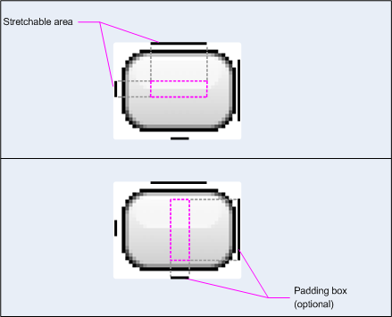
该格式相对于一般PNG图片来说,多了上下左右各一条1px的黑线。左、上黑线隔开了9个格
子,当中一个格子(见上图Strechable
Area区域)声明为可以进行拉伸。右、下两条黑线所定义的Paddingbox区域是在该图片当做背景时,能够在图片上填写文字的区域。每条黑线都是可
以不连续的,这样就可以定义出很多自动拉伸的规格。Android
sdk中提供了设置的工具,启动命令位于:$ANDROID_SDK/tools/draw9patch.bat,使用它对于原始PNG进行设置9-
patch格式,非常方便,如下图。
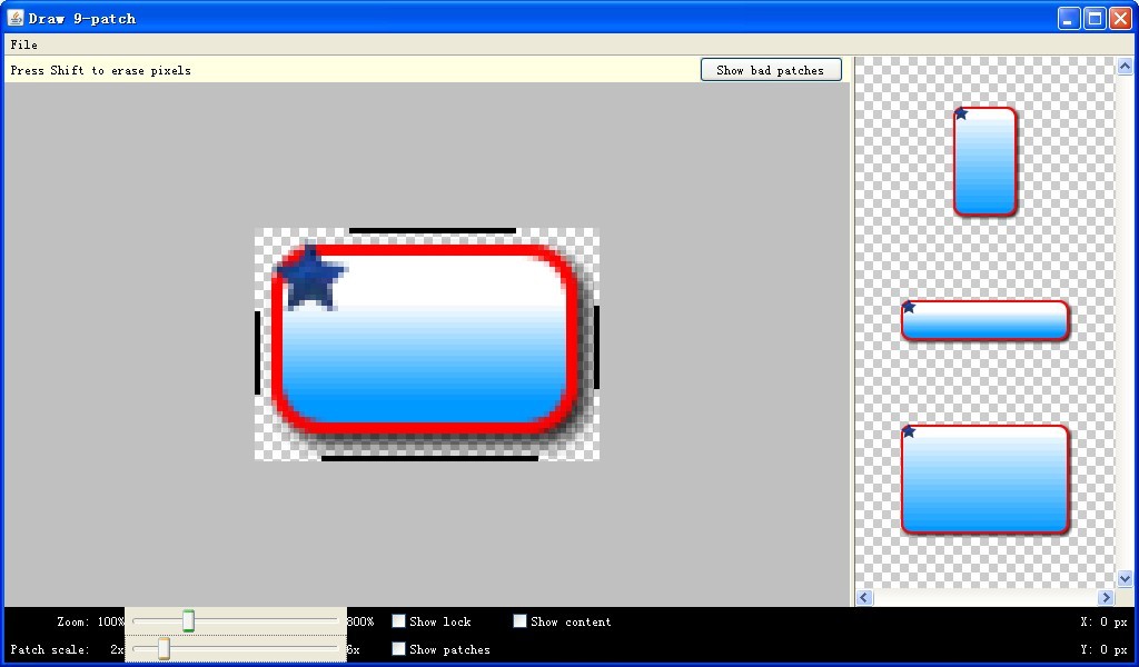
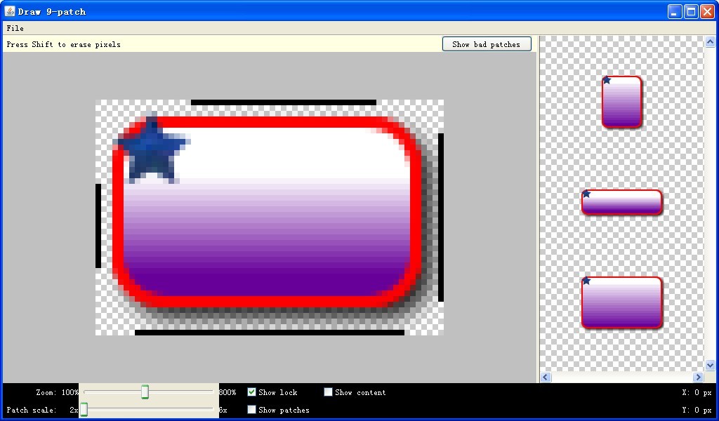
draw9patch工具的右侧是能够看到各方向拉伸后的效果图,你所要做的就是在图上最外侧一圈1px宽的像素上涂黑线。
注意,在draw9patch.bat第一次运行时,sdk2.2版本上会报错:java.lang.NoClassDefFoundError:org/jdesktop/swingworker/SwingWorker。需要下载swing-worker-1.1.jar
,放入$android_sdk/tools/lib路径下,成功运行。
此种方法实现的步骤如下。
(a) 使用draw9patch.bat作完图片后,得到两张按钮背景,分别是正常和按下状态下的,命名为bg_btn.9.png和bg_btn_2.9.png。
(b) 编写图片使用描述文件bg_9patchbutton.xml。
-
// in bg_9patchbutton.xml
-
<?
xml
version
=
"1.0"
encoding
=
"UTF-8"
?>
-
<
selector
xmlns:android
=
"http://schemas.android.com/apk/res/android"
>
-
<
item
android:state_pressed
=
"true"
-
android:drawable
=
"@drawable/bg_btn_2"
/>
-
<
item
android:state_focused
=
"true"
-
android:drawable
=
"@drawable/bg_btn_2"
/>
-
<
item
android:drawable
=
"@drawable/bg_btn"
/>
-
</
selector
>
(c) 在界面定义文件 layout/main.xml中添加Button、ImageButton按钮控件的定义。Button、ImageButton都是可以使用背景属性的。
-
<
Button
-
android:layout_width
=
"120dip"
-
android:layout_height
=
"40dip"
-
android:text
=
"9-patch图片背景按钮"
-
android:background
=
"@drawable/bg_9patchbutton"
/>
-
<
Button
-
android:layout_width
=
"200dip"
-
android:layout_height
=
"40dip"
-
android:text
=
"9-patch图片背景按钮"
-
android:background
=
"@drawable/bg_9patchbutton"
/>
-
<
Button
-
android:layout_width
=
"120dip"
-
android:layout_height
=
"80dip"
-
android:text
=
"9-patch图片背景按钮"
-
android:background
=
"@drawable/bg_9patchbutton"
/>
-
<
ImageButton
-
android:layout_width
=
"120dip"
-
android:layout_height
=
"40dip"
-
android:src
=
"@drawable/bg_9patchbutton"
-
android:scaleType
=
"fitXY"
-
android:background
=
"@android:color/transparent"
/>
以上2种实现按钮的美化,都是标准的矩形按钮为基础。在一些应用中我们可以看到漂亮的自定义形状的异形按钮,这是怎么实现的呢?经过一番研究和实践,找出了一种方便的方法,就是使用ImageButton加上9-patch就可以实现漂亮的自动延伸效果。
3. 自定义形状、颜色、图样的按钮的实现
步骤如下。
(a) 设计一张自定义形状风格背景的图片,如下图。
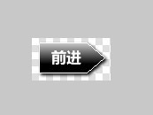
(b) 未点击和按下后的状态各做一张,形成一套图片,如下图。
 forward.png
  forward2.png
(c) 创建和编写按钮不同状态的图片使用描述文件drawable/ib_forward.xml
-
// ib_forward.xml
-
<?
xml
version
=
"1.0"
encoding
=
"UTF-8"
?>
-
<
selector
xmlns:android
=
"http://schemas.android.com/apk/res/android"
>
-
<
item
android:state_pressed
=
"true"
-
android:drawable
=
"@drawable/forward2"
/>
-
<
item
android:state_focused
=
"true"
-
android:drawable
=
"@drawable/forward2"
/>
-
<
item
android:drawable
=
"@drawable/forward"
/>
-
</
selector
>
(d) 在界面定义文件 layout/main.xml中添加ImageButton按钮控件的定义。
-
// in layout/main.xml
-
-
<
ImageButton
-
android:layout_width
=
"80dip"
-
android:layout_height
=
"40dip"
-
android:src
=
"@drawable/ib_forword"
-
android:scaleType
=
"fitXY"
-
android:background
=
"@android:color/transparent"
/>
分享到:


相关推荐
本文实例讲述了Android自定义Button并设置不同背景图片的方法。分享给大家供大家参考,具体如下: 1、自定义MyButton类 public class MyButton extends Button { //This constructormust be public MyButton...
android studio 自定义标题栏,自定义回退按钮事件,自定义右侧显示文字还是图片,自定义右侧点击事件
android studio 自定义button边框,角度,渐变颜色按下时改变样式, 以及基础动画,为image view添加旋转,下移,渐变等样式,使用timer handler button进行控制。
C# 自定义控件 自定义Button控件 水晶按钮。其他控件的重写与此类似
android 自定义各种风格button
android 自定义Button效果
Android自定义Button的通用方法
自定义Button,利用paintComponent方法。
安卓 android 自定义 switch button,滑动开关,绝对漂亮美观
本代码包含自定义按钮代码以及调用代码,下载后可直接运行。
PB自定义button控件 带移入移出效果 自定义背景色 边框
在安卓开发中,我们经常用到Button按钮这个空间,默认系统提供的Button按钮样式比较单调,不适合项目应用 * ,通常我们需要自定义Button样式,自定义Button样式有三种: * 1、使用.9格式图片作为Button背景,或者...
自定义View实现随滑动由箭头变对勾的指示按钮
android自定义view万向按钮,可以输出无极量,值得你拥有
Android 波浪按钮,支持多种效果自定义
Android自定义view:十字按钮本十字按钮可用于智能家电app,通过设置listener就可以监听四个方向的点击事件,同时其button的反应模式如系统给的button一致。在代码中也给出了另外五个普通按钮进行与十字按钮进行效果...
C#自定义按钮源码,封装CustomButton类,可以自定义按钮背景图片,当然,仅仅只是抛砖引玉,可以沿着该思路设计出其它功能的用户自定义控件,开发环境vs2010。
Android listview例子, 采用自定义Adapter:包含了Button控件
模仿button按下抬起,添加动画,手指移动还原抬起动画。
Ubuntu16.04 + Qt5.7.1,qml实现的简易图标按钮控件。